Blue is one of the most versatile colors in interior design, and it’s having a major moment in 2026. Whether you’re repainting a bedroom, refreshing a kitchen, or reimagining an entire floor plan, blue color schemes offer both aesthetic appeal and practical design benefits. Unlike trendy colors that fade fast, blue has staying power, it works in traditional homes, modern minimalist spaces, and everything in between. The challenge isn’t finding a reason to use blue: it’s choosing the right shade and pairing it with complementary colors that match your room’s purpose and your personal style. This guide walks you through the best blue color schemes for every room, why blue works so well in homes, and how to apply these palettes to your next project.
Table of Contents
ToggleKey Takeaways
- Blue color schemes offer lasting design appeal across traditional and modern spaces because blue reduces stress, ages gracefully, and adapts to any design style without feeling dated.
- Understanding blue undertones is essential—cool-toned blues with gray undertones feel modern and formal, while warmer blues with green undertones feel more grounded and approachable.
- Light blue palettes create openness in smaller or dimly-lit rooms and pair beautifully with whites, creams, warm grays, and natural wood tones to avoid a sterile feel.
- Deep navy blue demands meticulous wall prep (filling holes, sanding, and stain-blocking primer) and typically requires three coats for solid coverage, making it ideal for accent walls or cabinetry rather than full rooms.
- Complement blue color schemes with warm metals like brass and copper, natural wood finishes, and a 60% blue, 30% neutral, 10% accent color ratio for balanced, intentional design.
- Blue works best in bedrooms and bathrooms for a restful atmosphere, in kitchen islands or lower cabinets for visual interest, and requires moisture-resistant paint in humid environments.
Why Blue Works: Psychology and Design Benefits
Blue has deep roots in human psychology and interior design for good reason. It’s calming without being boring, sophisticated without demanding constant maintenance, and adaptable across virtually any design style. Psychologically, blue reduces stress and promotes focus, which is why it works beautifully in bedrooms, home offices, and bathrooms where you need to decompress. Designers favor blue because it doesn’t demand constant repainting: neutral blues age gracefully over years, whereas hot pinks or saturated oranges often feel dated within a season.
From a practical standpoint, blue reflects light differently depending on the undertone. Cool-toned blues with gray undertones feel modern and slightly formal. Warmer blues with green undertones (like slate blue or teal) feel more approachable and grounded. Understanding these undertones is crucial when selecting paint samples, what looks blue in the store might read purple, green, or gray on your actual walls under your specific lighting. Always paint large swatches (at least 2 feet by 2 feet) and observe them at different times of day before committing to a full gallon of paint.
Light Blue Palettes for Airy, Open Spaces
Light blue, think pale sky blue, dusty periwinkle, or soft cornflower, creates an immediate sense of openness and calm. These shades work particularly well in smaller rooms, north-facing spaces that get little natural light, and homes where you want a cohesive, breezy feel. Light blue also pairs exceptionally well with white or cream trim, which amplifies the airy effect and makes ceilings feel higher.
When working with light blues, pay attention to undertones. A blue that’s too purple (like a French provincial lavender-blue) can feel dated if not paired correctly. Stick with blues that lean slightly toward gray or green for a contemporary feel. Many homeowners skip the primer when painting over white, but don’t, use a quality primer on the first coat, especially on porous drywall, to ensure even coverage and prevent the underlying surface from showing through. Light blue typically covers in two coats with proper prep.
Light blue pairs naturally with whites, creams, warm grays, and soft greens. Gold or brass hardware and fixtures add warmth without fighting the cool palette. Avoid mixing too many cool neutrals in one space: the room can feel sterile. Instead, ground the light blue with warm wood tones, natural textiles, or a few warm-toned accessories.
Deep Blue and Navy for Sophisticated, Cozy Rooms
Navy and deep blue (think rich, saturated, almost-black blues) create instant sophistication and drama. These are power colors, they make a statement without shouting. A deep blue accent wall can define a space, anchor furniture placement, and make adjoining light colors pop. Navy pairs beautifully with gold, warm whites, and rich wood tones, making it a favorite among designers tackling traditional and transitional interiors.
Here’s the practical catch: dark blue requires more prep work than light colors. Ensure walls are clean, smooth, and properly primed. Dark colors highlight imperfections, every drywall patch, texture inconsistency, and dust particle becomes visible. Fill nail holes with spackling compound, sand smooth when dry, prime with a stain-blocking primer, then apply two coats of paint. Budget an extra coat or two compared to light colors: dark navy typically needs three coats for solid coverage.
Navy works brilliantly on accent walls, built-in shelving, or even exterior trim where it won’t feel overwhelming. In open-concept spaces, use deep blue strategically, a navy island in an otherwise light kitchen creates visual interest without closing in the room. Lighting matters: deep blue under harsh fluorescent light can look almost black and depressing, while the same blue under warm incandescent or LED bulbs feels rich and inviting. Test your paint choice under the actual lighting you’ll use.
Pairing Blue with Complementary Colors and Accents
Blue sits opposite orange on the color wheel, making warm oranges and terra cottas natural complementary partners. But, you don’t need to go full color-wheel opposite: consider softer warm tones like warm grays, warm whites, taupe, or peachy neutrals. These create balance without clashing. Designers know that 35 striking colors that go with blue often include unexpected pairings like sage green, soft pink, or charcoal gray.
When accessorizing a blue room, warm metals (brass, copper, warm gold) feel more contemporary than cool silvers or polished chrome. Natural wood tones ground blue beautifully, whether it’s a walnut dresser, oak shelving, or cedar trim. Textiles offer a low-commitment way to test color pairings: swap throw pillows and blankets until you find the balance that feels right. Start with 60% blue, 30% neutral, and 10% accent color as a rough guideline, the accent color doesn’t need to dominate to be effective.
White and cream always feel safe with blue, but don’t overlook warm grays or soft beiges for more personality. A pale warm gray paired with soft blue creates a sophisticated, cohesive look that feels intentional rather than defaulting to a basic blue-and-white scheme.
Blue Color Schemes by Room: Practical Applications
Bedrooms and Bathrooms
Bedrooms are the ideal first project for blue color schemes because the payoff is immediate and personal. Light to medium blues create a restful environment without feeling institutional. A soft blue wall paired with white bedding and natural wood flooring feels both calming and timeless. For bathrooms, consider that moisture and humidity affect paint durability, use a high-quality bathroom-grade paint with mildew resistance. Pale blue in a bathroom expands the sense of space, which is crucial in smaller bathrooms.
In bedrooms, you can afford to be bolder with an accent wall behind the headboard or with deep blue cabinetry in an attached bathroom. The accent draws the eye without overstimulating a space meant for rest. Avoid shiny finishes in bedrooms: matte or soft eggshell finishes feel calmer and hide imperfections better than glossy sheens.
Living Rooms and Kitchens
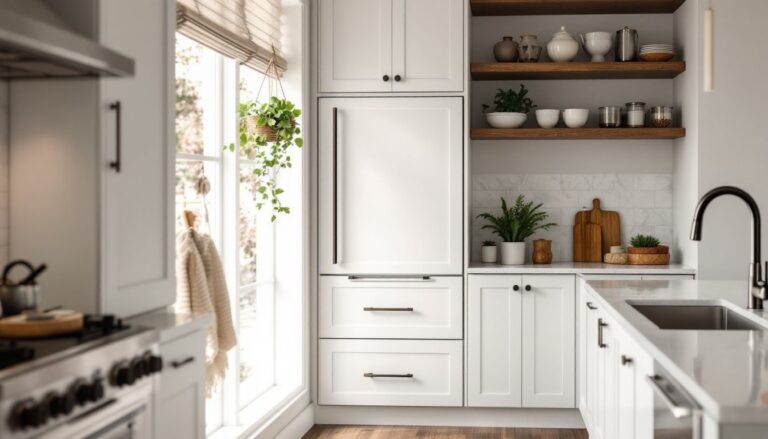
Living rooms benefit from medium blue walls that feel inviting and sophisticated. Pair them with warm wood furniture, natural textiles, and adequate lighting to avoid a cave-like feel. Blue kitchens require more consideration because kitchens are traditionally associated with cleanliness and appetite stimulation (warmer colors). A soft, warm-toned blue (leaning slightly green) on kitchen walls works well, but consider using blue on kitchen island cabinetry or lower cabinets while keeping upper cabinets and walls neutral. This gives you the visual interest of blue without overwhelming the space.
For kitchens, Home Bunch’s interior design inspiration showcases how professional designers use blue strategically in kitchen islands and cabinetry without sacrificing the space’s functionality or appetite appeal. If you’re painting kitchen cabinets, use a primer specifically formulated for cabinet paint, apply thin coats, and allow proper drying time between coats. Kitchen cabinets take significant wear, so invest in paint rated for cabinets or furniture, standard wall paint will chip quickly on cabinet surfaces.